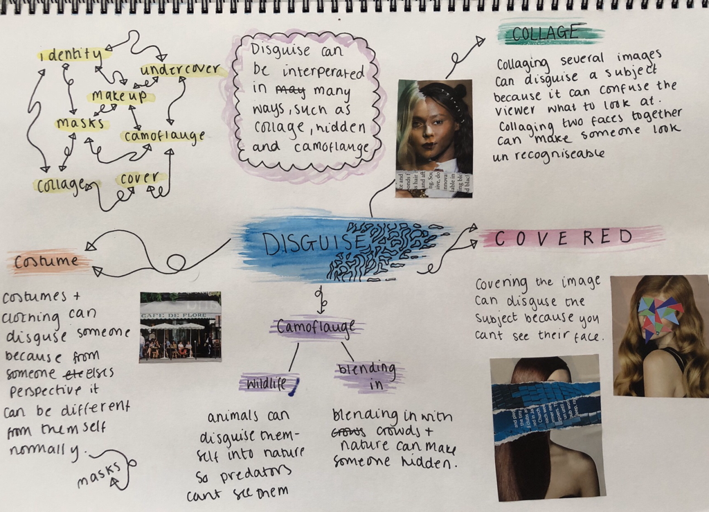
DISGUISE
I chose the option “disguise” because out of the projects I found it to look the most interesting. The images are all different styles but all have many things in common. The main subject of the picture is either covered with other images of people and objects or missing features to make it unclear of what the original image is.


John Stezaker
John Stezaker is a british conceptual artist. His work consists of him collaging old postcard, film stills and commercial photographs to create new images. He rips, layers and cuts them to make “disguised” photographs of the people inside image. I find his art unique and different because he mixes black and white with colourful images (often landscapes and recent portraits of people) which makes it stand out. His art in my opinion shows the concept of disguise.
John Stezaker is a british conceptual artist. His work consists of him collaging old postcard, film stills and commercial photographs to create new images. He rips, layers and cuts them to make “disguised” photographs of the people inside image. I find his art unique and different because he mixes black and white with colourful images (often landscapes and recent portraits of people) which makes it stand out. His art in my opinion shows the concept of disguise.


|
From this video, I’ve learnt that when layering and collaging my images, I have to think about the part I’m covering. Thinking about the part I’m “subtracting” can change the whole image completely. Chosing what will cover the original image can change the overall outcome, I have to make sure both images compliment each other.
|
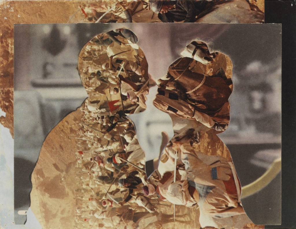
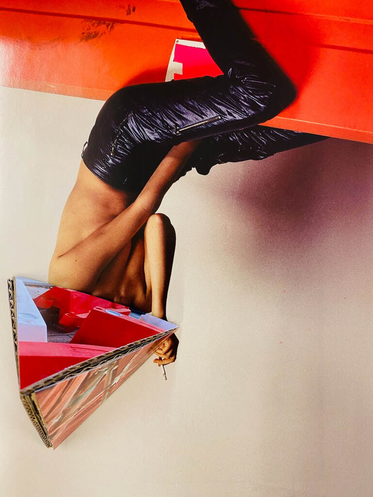
Out of John Stezaker's images, i find this one the most intriguing. I like the way he cut out the two people completely leaving an outline of their face and body. I also find the background image interesting, it seems like its landfill but i'm not entirely sure. it makes me wonder why he chose that as a background and why he chose it to replace the people.
Image Analysis
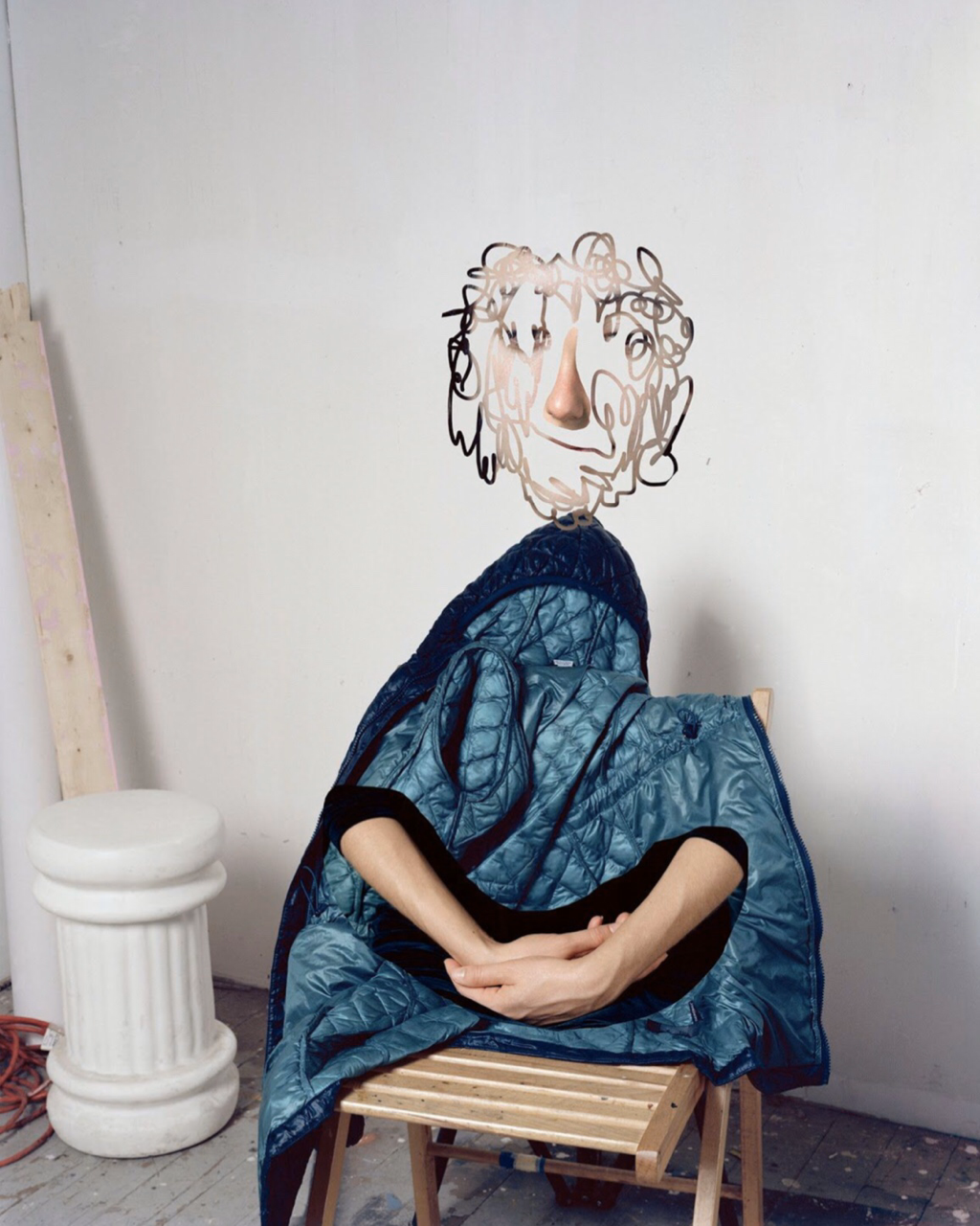
In the image “Tessa sitting” the main subject looks as if it’s a sculpture. It’s a wooden chair with a blue puffer jacket laying over it. Crossed over hands have be photoshopped/collaged on top to make it seem like the it’s a person with a jacket on. The “face” (which I believe is Tessa) has been disguised, because it's been editedin an unusual way. To me it seems like someone has drawn squiggly lines over an image, but only where the lines have been drawn is where the face is visible. The tones in the image are cool and not bright. Most colours seen are white, beige and blue (and a little bit of red in the back). The photograph looks like it’s been taken in an art studio or a room being refurbished (because of all the paint on the wooden floor). The unusual portraiture seems abstract to me because of the sense of collage and sculpture seen in the image. It's not your average portrait of someone.
I think Lucas Blalock created this image using Photoshop. Blalock may have taken the image of the wooden chair and coat (maybe not knowing he was going to digitally collage it) to experiment with. With theimage on top of the girl he cut out the part of her hands and layered it on top with Photoshop. I'm not entirely sure how he made the face look like that, but it looks as if wherever he drew squiggly line is where the image would show. He put the head onto of the jacket to make it seem like the person was wearing it.
While looking at the image it makes me feel quite empty and gives me a slight emotion of being panicked and anxiety. I think this is because I have never really seen an image like this before. The face confuses mebecause I'm not sure why or how he chose to make this, but I also find it the most intriguing. If I could ask Blalockanything about this image, I would ask him if he planned on creating this image or it just happened while he was experimenting. I would also like to ask him why this was his chosen composition. The composition is quite plain but because of the collaging it makes it seem more interesting in my opinion.
Researching a bit about Lucas Blalock has helped me understand the creation of the image. Blalock likes to use, what he calls, the “dumbest” tools in Photoshop. The video shows him using the eraser and masking tool. He takes an image and enhances what he sees. He can remove or multiply what he wants to but erasing it. He uses very simple methods and tools but his images, to me, seem very difficult. This image links to “Disguise” because the face has been half erased in Photoshop and there is no actual body (apart from the hands) in the photo. When identifying a face I believe the eyes are the most important to see, but he has removed it from the image making her face disguised.
My Response


For my final artist response i tried to use Blalock's techniques. I didn’t have photoshop available so I used a different app. I’m pleased with how they turned out because I think it captures the sense of the artist. I used the eraser tool to draw squiggly lines over the subjects to erase the background so you can only see part of the faces. My favourite image I created is the middle one because I like how it looks collaged. In all the images you can’t see anyone’s whole face, you can only see parts.
Make Do & Mend Collage


Instruction-based photograph
“Take a picture of the stars”
Some artists have embraced the idea of constraints and restrictions in their practice. In this experiment, one of my classmates gave me an instruction and my job was to make a photograph based on it. I wouldn't normally have chosen the stars as a subject so it was a challenge to have to respond to an instruction from someone else and I had to come up with a creative solution.


For this task I found it hard to take actual images of the stars because of the light pollution in London and my camera can see them. Instead, because the instructions didn’t say they had to be real, I went looking for stars around my house and photographed what looked bright or shaped as a star. Many photographers and artists follow set instructions either from them selves or others to give them a sense of guidance. Over all i did enjoy this task, even though i found i quite differcult, because I've never quite had to follow set instructions for photography and it was nice to do something different.
Marcel Duchamp and Appropriation
Marcel Duchamp's 'L.H.O.O.Q' was a cheap postcard reproduction of the famous 'Mona Lisa'. Duchamp drew facial hair onto the image using a pencil which created a new image. This could have seen controversial during the time period because it did not fit the ideal beauty standard. Marcel Duchamp created a new meaning readymade by taking an already made image and altering it to create new art.
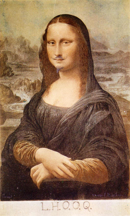
Marcel Duchamp’s picture ‘L.H.O.O.Q.’ (1919) uses a postcard reproduction of Leonardo da Vinci’s ‘Mona Lisa’ (1503-17). Describe Leonardo’s painting and explain why it is so famous. Da Vinci painting “Mona Lisa” is an image of a seated woman in front of an imaginary landscape. She has a faint smile and crossed arms. It was placed in the Louvre, a famous gallery in Paris, and went unnoticed for many years. In 1911 it went missing until found in an Italian waiter’s room two years later. Once returned to the Louvre the painting became more famous.
Marcel Duchamp added a moustache and beard to the ‘Mona Lisa’. This could have been seen as quite controversial during the time because people were not used to seeing women with facial hair or masculine features. The title “L.H.O.O.Q” is a word play so that when it is pronounced in French it sounds like “Elle a chaud au cul”. The title translated to English is “she has a hot arse”. The title can be seen as a joke and not an attack on the painting itself.
The term readymade is an object or image created by someone then modified to create something new. “L.H.O.O.Q” can be seen as a readymade because Marcel Duchamp drew on top of a postcard of the ‘Mona Lisa’ and added facial hair to create a new piece of art.
His idea of a readymade was such a revolutionary in art because no one else had quite done it before. Instead of creating something from scratch Duchamp used what resources he had and created something different either by adding something small or really noticable.
Sharon Walters


Sharon Walters is a London based artist who creates vibrant, hand-made collages. Walters created her pieces by using images of black woman from magazines, and cutting out sections of highlights and shadows.
My images inspired by her:
My images inspired by her:


My Readymades
I attempted to make my own Readymades (inspired by Duchamp) using images from old books, magazines and catalogues about photography.


|
For my 3rd experiment I created a stop motion animation of a portrait I worked on. I started off by cutting the image into strips and rearranging them. I then cut them into to squares. I liked how the squares looked as an image. I jumbled them up and placed them in a new order.
|
Over the last two lessons I’ve been creating ready made images inspired by Kensuke Koike. The images I’ve created took the idea of... by cutting them up and altering them by replacing or moving the image around. For some images I cut out sections and placed another portrait underneath to make it match up but have an odd look.


|
WWW: out of the ready mades I've made over the past few lesson, This set is my favourite. I like how I overlapped images over each other where the faces lined up.
|
EBI: If I got the chance to redo this image I would cut out sections in the back to add more texture and make the image more interesting. I would also like to add a sense of colour to make it more contrasting and make it more appealing to the eye.
|
Image Analysis
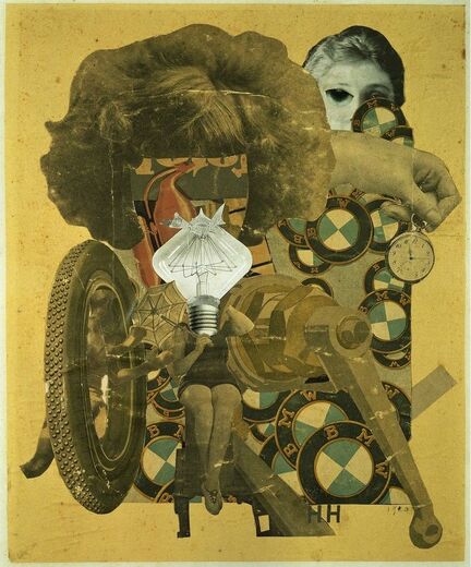
The image “The beautiful girl” by Hannah Höch is a collage. In the image Höch has layered pictures cut from newspapers and magazines. I can see two different themes throughout the image, one being cars and tools and the other women’s bodies. Towards the centre of the image there’s a woman sitting down holding an umbrella, on what seems to be a bench, with no head. Höch has replaced her face with a white lightbulb, which stands out against the rest of the images because it doesn’t have a yellow tint. Above the lightbulb is a cut out of a woman's hair. The hair seems like an enlargement of what the woman’s hair below would look like. Underneath the collage is a layer of BMW logo badges. This can fit in with the tools theme because cars and tools, when this image was created 100 years ago and sometimes today, were viewed as more masculine.
The part of the images which strikes me as the most important is the woman's body and cut out of the hair. I believe this is the most important section because those parts represent “the beautiful girl”. At first it may be hard to see both cut outs link together because there is a lightbulb separating them, but the hair seems to be an enlargement from the woman's body. This is important to the piece because it contrasts with the rest of it. The rest of the collage is filled with more traditionally “manly” things like cars and tools.
In the image two parts stand out to me. One section seems to symbolise the feminine and the other the masculine. The image was made in 1920, when gender equality was rarely thought about. I believe a reason Höch created this image with two different sections was to test the stereotypes of the time.
A lot of the image is created using images of car logos, car wheels, and tools whereas the rest contrasts with it because it's filled with female forms.
The title “the beautiful girl” could be seen as challenging to the image. A lot of the collage is made up of parts that may not be appealing to what a woman would be interested in during the time period. It's ironic because an image with a “beautiful girl” is filled with other aspects like male interests. The title gives a meaning to the image because I believe Höch is trying to show a beautiful girl can be interested in other things and test people's views.
The image is:
- Overwhelming – The piece is quite overwhelming because at first glance it’s difficult to fully see what the artwork consists of. It’s filled with so many images which are all so important to the collage.
- Controversial – Considering the piece was made in the 1920s, it could be seen as quite modern and challenging for its time.
- Chaotic – With the piece being a collage, there is evidently a wide variety of images. It’s hard to make sense of how they all connect, which creates a chaotic yet intriguing overall effect.
- Where did the idea come for the name of the image? Did she choose it on purpose to make us question the idea of a traditional “beautiful girl”?
- Were the images from the same magazine? Or were they from two opposites, and that’s where the idea came from?
- Is there meant to be a relation between the woman and the cars?
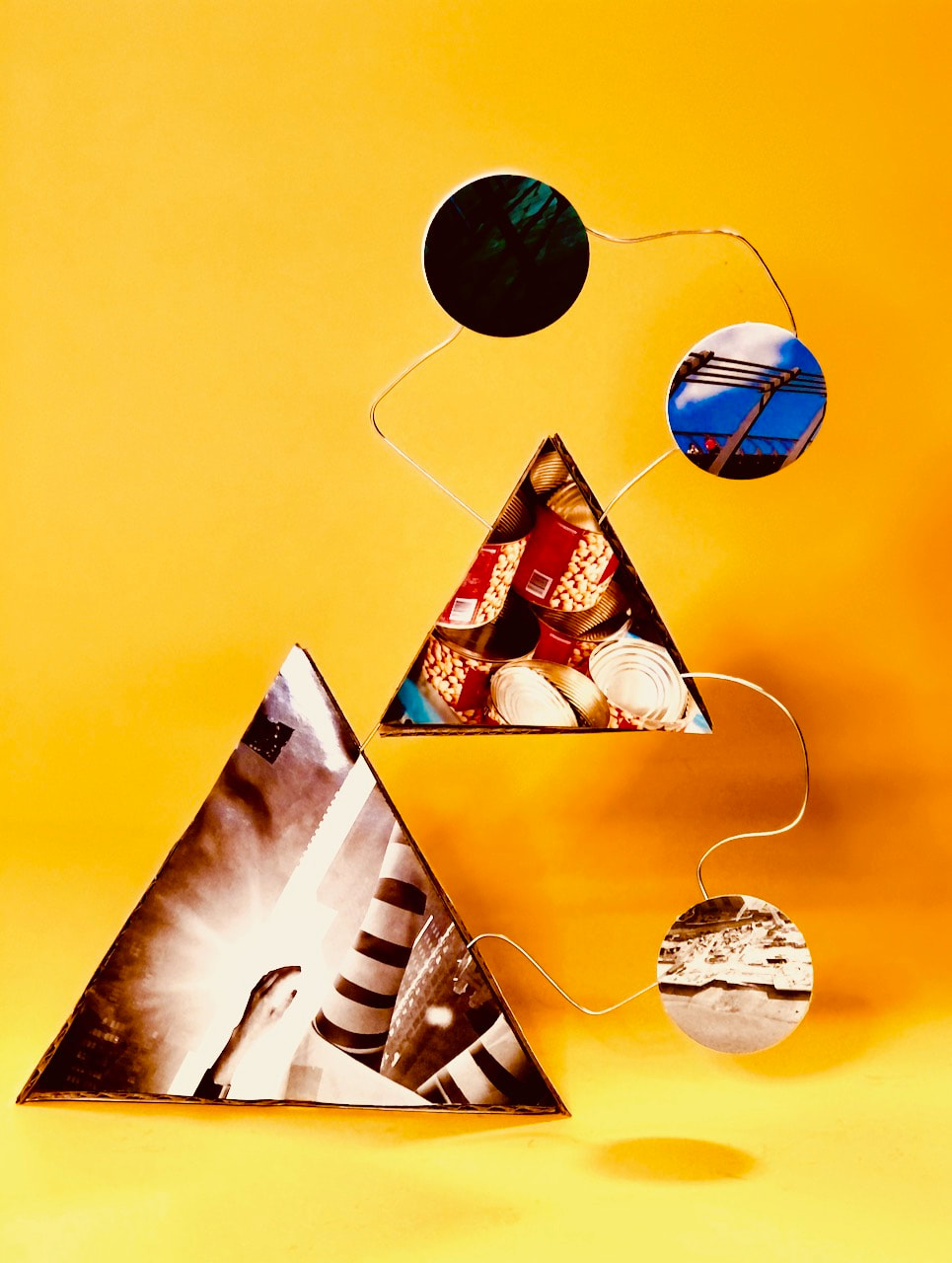
3D > 2D > 3D > 2D
Matt Lipps research
Lipps creates images buy collecting cuttings from used newspapers and magazines and transforms them into 3D collages. He layers images over each other then photographs them to make a new meaning. Some of his work is created by removing part of an image then replacing it with a new background to create a silhouette. Other pieces are made by placing cuttings in front of one another.
My 3D photocollages #1
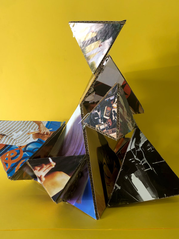
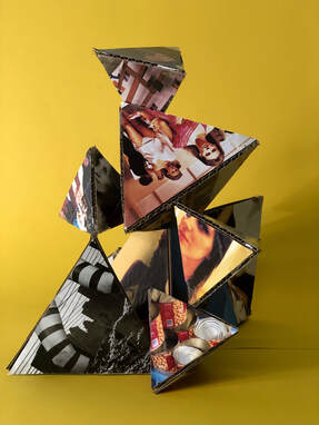
Daniel Gordon research
Daniel Gordon creates still life collages. His images are created by layering vibrant and colour cut out objects. His art looks 3d by the way he’s placed them on a certain background. His images consist of cut outs from magazines and newspapers, normally pictures of food or objects.
3D Collages #2
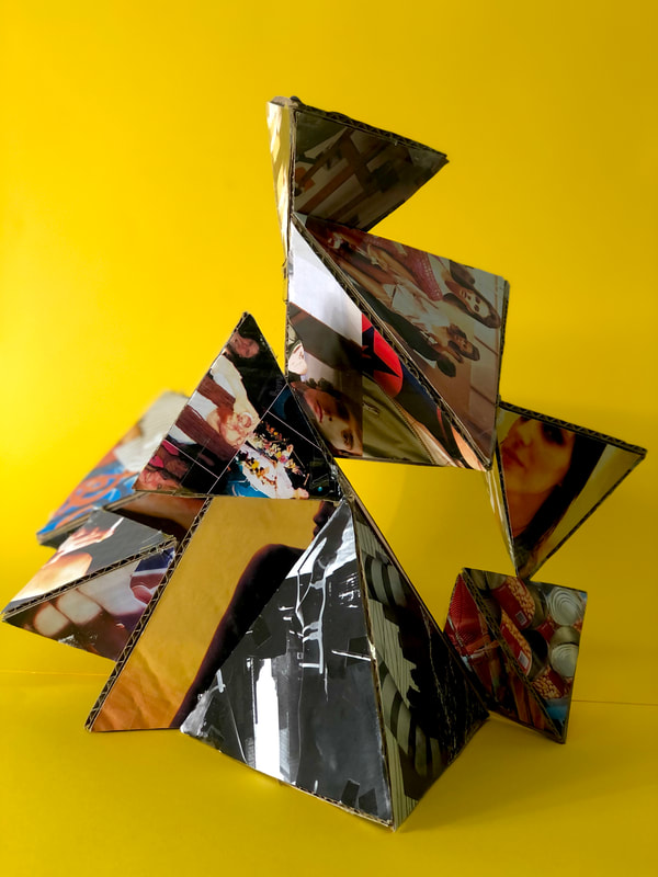
My tabletop sculpture shoot
I decided to make a small tabletop sculpture with everyday materials. My plan is to print these images at some point and make a photosculpture with them.


Making Day #1
Photocollage research
In preparation for a whole day of photocollage making I researched the following images, comparing and contrasting them.


|
Romare Bearden, Evening 9:10, 461 Lenox Avenue, 1964
-Collage -Abstract -old images turned into a new picture -Still life |
Hannah Hoch, Lebensbild (life picture), 1972/73
-Layering -Portraits -Same person, growing up? -collage |
Between both collages, one thing that really stands out to me are the main subjects of the images. Both pictures seem to tell a story to me. Beardens looks a still life of a family having a dinner or gathering of friends. Hochs image comes across to me as a story of a woman. The images within the collage look as if it’s the same woman through out her life ageing, and showing accomplishments. A similarity between both collages is the black and white images used.
Making Day #1 photocollage experiments:
For today's Making Day we were given 5 hours to make 2D photocollages. To continue with the theme "Make Do and Mend" we were given old images and other photographers' work to form a new piece of art.
Collage #1+2


For my first collage, I wanted to do a vibrant coloured piece. I wanted to limit myself to one picture to see what I could create. I began by choosing an image of a young girl and photocopying it several time in different colours. The aim was to recreate the original image, but switch it up by sectioning different areas and blocking them off with colour. I did this by cutting the coloured paper in different shapes, trying not to make harsh straight lines, and position the pieces back into the original image of the girl. I like how the images came out because it reminds of pop art.
Collage #3


|
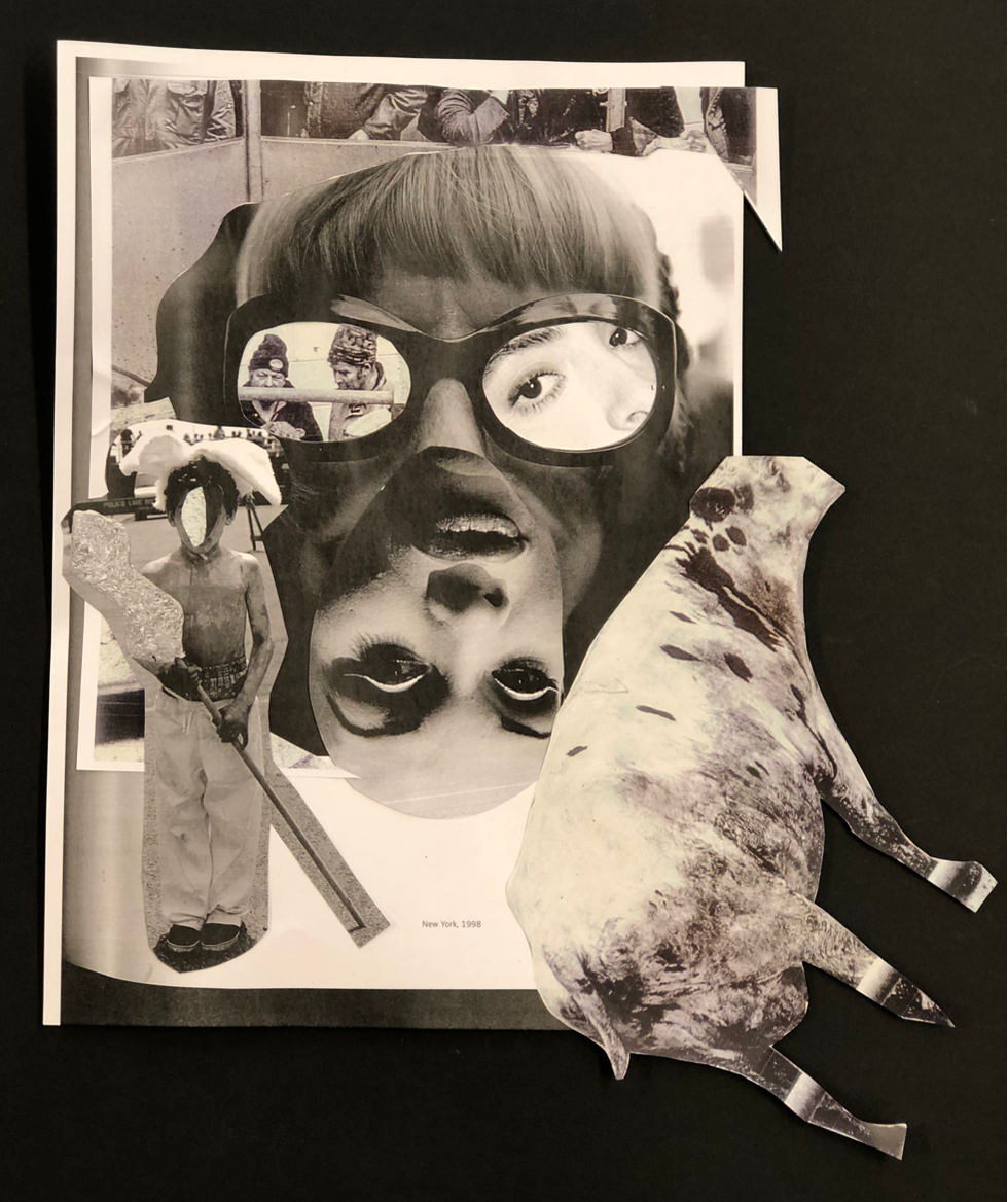
My aim for the session was to create three final collages, but i used most my time making the first two. I wanted to do make a completely different response to my first two which were both insanely colourful and portraits. In the end i chose to do a black and white piece to contrast with the first attempts. I stuck to one photography book filled with b+w images and printed of a bunch. I cut up the main subjects within the pictures and began to layer them. I found a composition a liked but wanted to try something different. I cut out the lens of someones glasses and replaced them with portraits of other people. I liked this idea because it made me think we can see the reflection of when shes looking at. Overall i'm happy with this image because I like how it contrasts the first two and explores different themes. But I do believe I could of added extra images to the back to make the piece more full.
|
Prison Photography
|
|
Klavdij Sluban Prison Photography WorkshopKlavidij Sluban is a photographer who goes into prisons and organises photography workshop for those who have been incarcerated. Sluban is concerned how prisons are so secretive and isolated nowadays, and believes people don't have a full understanding on what prisons are actually like. Within Slubans photography workshops ,as well as photographing the inmates and surroundings, he hands out disposable cameras to allow them to take images because he believes learning to see photographically is beneficial to people who have lost their freedom. He begins the workshop by handing the cameras out straight away because he wants to gain their trust and not do it sneakily. At arrival he notices the lack of activity within the prison, his students says there's a sense of "Nothingness", but soon teaches them to photograph it to the best of their abilities.
|
Sluban notices within his classes of students most of them tend to photograph them self or others. He believes this could be a way of their self expression, but some students tend to go beyond that idea and take more creative images. He pushes them to take more risks within their artwork and show more creativity. He hopes that his workshops leave the inmates with more freedom and a sense of purpose.
Nicolo Digiorgis Prison Photography
These set of images by Nicolo Digiorgis are from his book 'prison Photography'. The book consists of 137 photos taken by the inmates of the Pental Institution of Bolzano, Italy. Through out the years of his workshop, he taught them the basics of photography like how to use a camera and what to capture. However, life in prison consists of restrictions and limitations. So in order to take the images they had to think of genres and themes.


Genre Photography Treasure Hunt


|
WWW:
Now I see all my images together in a grid, I like how they compliment each other. I tried to stick to a colour scheme so in the end the pictures would look complete next to one another and create a nice set. I did struggle with this task, due to only having 1 hour to complete it, but in the end I believe I captured the subjects in unique and different way. |
EBI:
Three images i would change 9, 12, and 13. I don't particularly like how they look in the grid compared to the other photos. The colours within the images do not go with the overall colour scheme and are partially not in focus. |
Photography Genre Collage #1
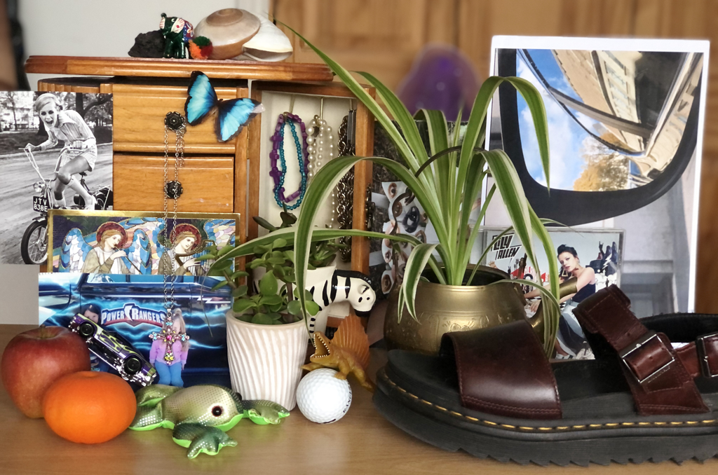
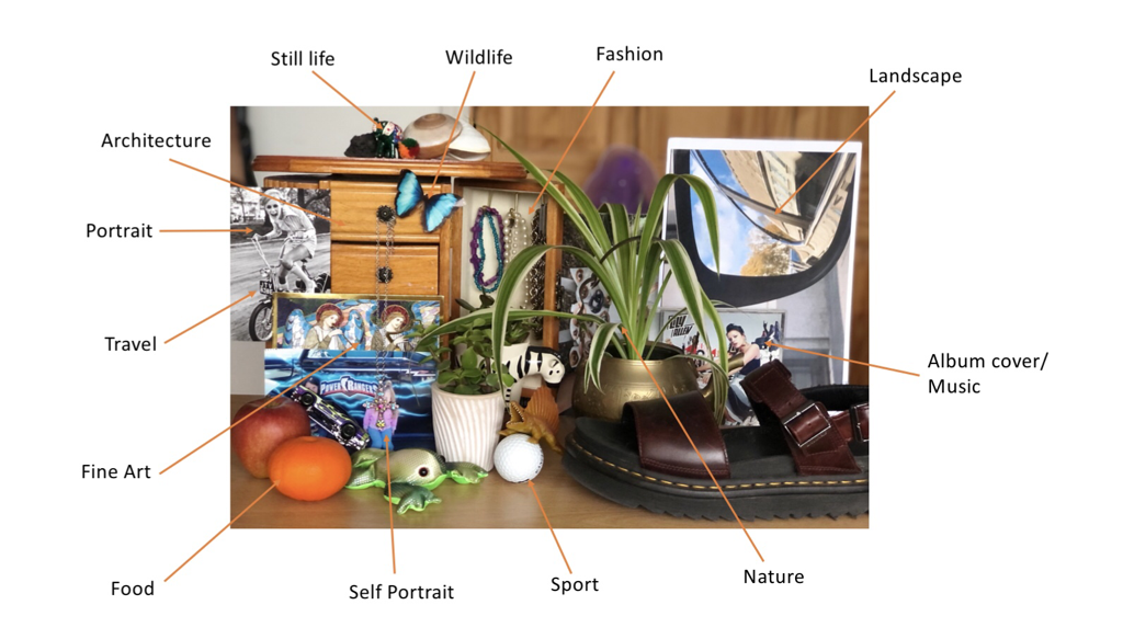
When being told I had to create an image which included as many genres as possible, my first thought was to gather everything that had a link to a theme. I collected objects around my room such as plants (nature), jewellery (fashion) and images (portraits). These all had obvious links to the genres, but I knew I had to include more. I started to grab more random objects and lay them out on a table, which was slowly beginning to create a collaged composition. Just by looking at the filled table, I could already see a lot more themes when randomly choosing objects rather than thinking to much about my choice. I took my final image, and decided to label it on powerpoint (as seen below) to see how many genres i explored. I overall found 13, but I believe if you think more outside the box you could possibly find more! I like my final result mainly because of how chaotic and colourful it looks. When you first look, the image seems very overwhelming, but when you section it off you can see multiple still life's disguised under one big collage.
Photography Genre Collage #2
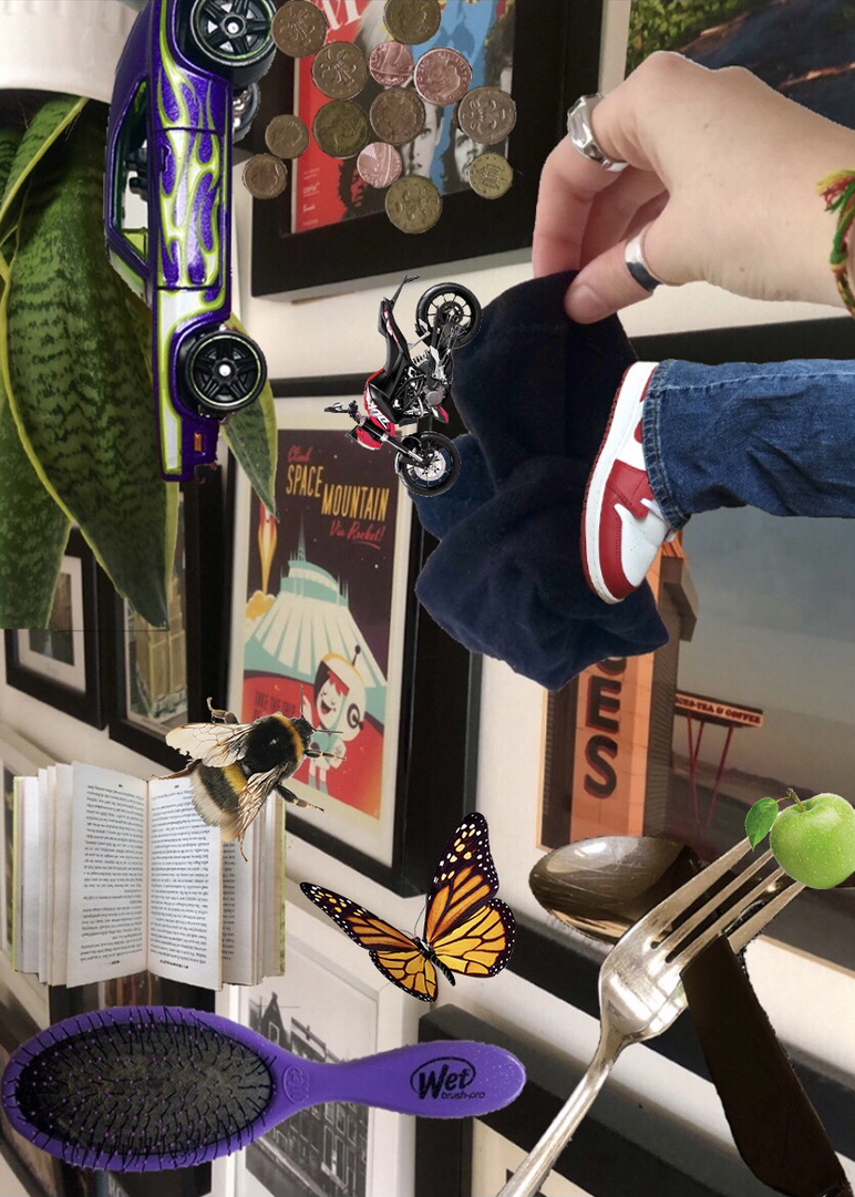
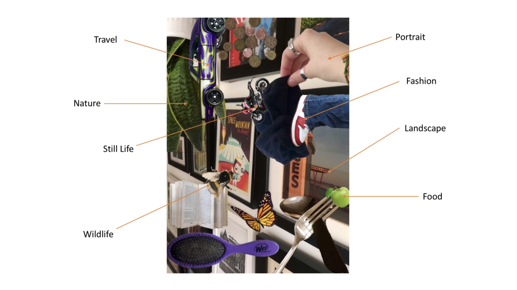
I decided to make another collage, but try a different technique. I used photoshop on my phone to layer images I previously took for the treasure hunt task. Because I used the photos from the treasure hunt, I already knew my collage would include some genres we spoke about in class. I resized and rotated my images as well as adding extra ones from the internet (Butterfly, Bee, Apple and Bike) which created my final result. I enjoyed the process of making this collage as I wasn't familiar with the photoshop app and enjoyed exploring it. The final result reminds me of some sort of album cover or poster, which you could say is another photography genre I purposely included!
My Photography Trip, Dubai UAE


Playground


|

|


Making Day Sculpture
|
|
|
