ALL GOOD ART IS ABSTRACT IN ITS STRUCTURE
-Paul strand
-Paul strand
What is abstraction in photography?
Abstract photography is a means of depicting a visual image that does not have an immediate association with the object world and that has been created through the use of photographic equipment, processes or materials.
Abstract photography is a means of depicting a visual image that does not have an immediate association with the object world and that has been created through the use of photographic equipment, processes or materials.
|
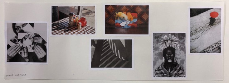
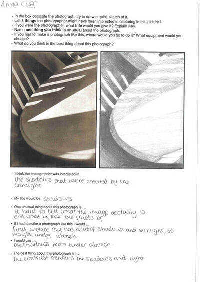
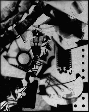
In class we we were told to put in order multiple pictures from most, to least abstract. The picture above was my order, I found this difficult because I wasn't entirely sure what abstract is. We decided to put the picture with the women with many twisted images as the the most abstract because I thought it was the most unique and different from the rest. we then copied the image with a lot of shadows next to it. I didn't think this image was the most abstract because I didn't actually know what it is. But it turns out the word abstract was in the title.
|


In lesson I took abstract photos around school. I was focusing on colour and line, and finding unique aspects about them. My favourite image I took was the first one because theres not much context in the photo, just someone who you can't see holding a label. I like how its next to a brick wall so the outline of the person is bold because of the contrast of light to dark.
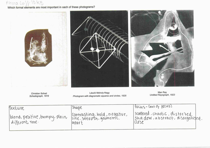
Formal elements
|
Focus:
Light: Line: Repetition: Shape: Space: Texture: Value/Tone: |
Which areas appear clearest or sharpest in the photograph? Which do not?
Which areas of the photograph are brightest? Are there any shadows? Does the photograph allow you to guess the time of day? Is the light natural or artificial? Harsh or soft? Reflected or direct? Are there objects in the photograph that act as lines? Are they straight, curvy, thin, thick? Do the lines create direction in the photograph? Do they outline? Do the lines show movement or energy? Are there any objects, shapes or lines which repeat and create a pattern? Do you see geometric (straight edged) or organic (curvy) shapes? Which are they? Is there depth to the photograph or does it seem shallow? What creates this appearance? Are there important negative (empty) spaces in addition to positive (solid) spaces? Is there depth created by spatial illusions i.e. perspective? If you could touch the surface of the photograph how would it feel? How do the objects in the picture look like they would feel? Is there a range of tones from dark to light? Where is the darkest value? Where is the lightest? |


For my second abstract photoshoot, I was focusing on the formal element, line. I retook most my images inside rather than outside because I thought I could see more visible lines. I like how all the photos I've taken have orangey tones in them because I think they all look nice together.


For my pictures I took outside school, I was focusing on colour and line. when I was out I noticed a lot of rainbows for mirror reflections, I like how it looked I thought it went well with the abstraction theme.
Personal project.
For my abstraction photography book, i want my book to be different to a normal book, I want it to be “abstract”. One of my ideas is to make it 3d or a pop up book. I think these ideas would be good because it goes with the idea of abstraction, as it is not your typical book.
For my abstraction photography book, i want my book to be different to a normal book, I want it to be “abstract”. One of my ideas is to make it 3d or a pop up book. I think these ideas would be good because it goes with the idea of abstraction, as it is not your typical book.
Photogram collage.


last lesson we made photogram collages by using old photograms. I ripped, cut and stuck different photos together to make the objets unrecognisable. once I made a collage, I photocopied it and then put it back into the printer so I could photocopy something on top of it. I used my "rubbish" to put on top the image. I then cut up the new photo into circles and mixed and matched.
with my uncut collage, I made photograms with the image. I did this by placing a photocopy of the collage onto photographic paper and placing it under the light for 8 seconds, depending on how dark I wanted it. I repeated this three times changing how long I left the light on or changed the size of the aperture, to change the exposer of the light. While I was making the photograms I noticed that if the photographic paper wasn't pressed flat underneath the collage, the photogram would come out blurry. so I made sure when I turned the light on it was flat down.
my favourite photogram I made was my last one, this is because its the clearest out of the three. after my first two tries I noticed that they were coming out to light and it had to be exposed to light for longer. the third time I left the light on for longer (1-2 seconds difference) and the image came out much better and clearer compared to the first two times.
|

|
|
At home abstract photos


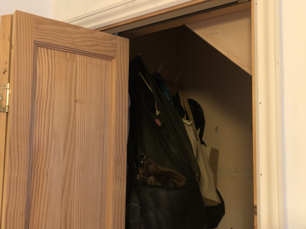


For my at home images, I decided to focus on the formal element of line. When taking the photos I was looking for bold outlines of objects. when taking the photos I noticed how there are many brown and black tones around my house, and I like how they all look together because of this.
|
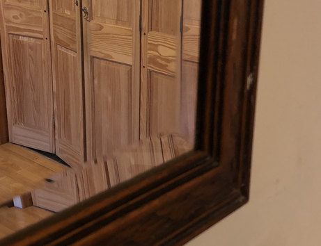
Favourite image
This is my favourite image because I like how the mirror is faced in different directions so it gives an abstract look. I also like how it’s focused on the wooden door and not the mirror frame even tho it’s closer to the camera. Out of all the photos I took, in my opinion, this was the most abstract and has the most different types of line in. |
Patrick Lears
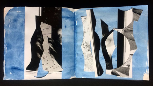
Cut up images laying over a blue water coloured page. folded directly down the middle, like a book. black monochromatic photos randomly placed in lines, the images are now unrecognisable.
the background is coated in blue water colour which gives a uneven texture.
Patrick Lears used to work as a photographer. He noticed black and white marks on the photographs, sometimes caused by being exposed or developed. he thought instead of throwing the images out he would cut and stick them together to create unique and different collages.
Photoshop


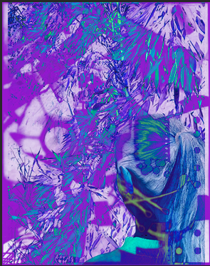
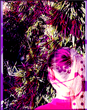
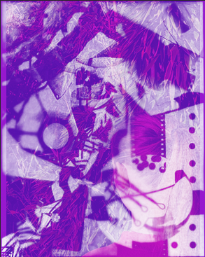
in todays lesson we were layering our photogram collages with one of the images on our website. I chose the one of the back of my friends head, floss, standing in front of a bush. I thought these two would pair nicely together because my collage is very packed and chaotic, while the other one is more plain. I find it easier to focus on the images separately.


Firstly I dragged my collage onto photoshop, I then selected image, mode then duotone. I changed the black tones of the image to purple, to give a more vibrant effect. I didn't change the white because the contrast between light and dark wasn't as visible with two different colours. Next I selected RGB colours on mode, this is so when I add another image on top the colours don't change like my collage.
I then added my second image on top by dragging it onto photoshop. Then I could start adding different effects by combining the two layers.
I then added my second image on top by dragging it onto photoshop. Then I could start adding different effects by combining the two layers.
Final results
|
|
|
I prefer these images to my first try because I think the colours and effects are nicer. Out of all three the first one I made, using the effect "difference", is my favourite. This is because I like how the photos are now unrecognisable and have been completely mashed into one. Another reason why I like it is because of how much its stands out to me, I find it the most vibrant of the three.


Over the half term I was collecting abstract images around my house or on the street. I was taking these photos from other perspectives from what I normally see. I was getting up close, down low or taking from a sideways angle. I like how all the photos look together because they all have the same colours involved. One colour that stands out to me is yellow, I think it makes the images vibrant.


Dafna Talmor
|
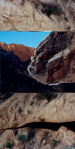
in this image created by Dafna Talmor, its series of different photos cut up and placed into a new composition. the photos used are of mountain ranges, rocks and places in a desert. the image looks as its divided into three, with photos of rocks on the top and bottom. The section in the middle is two images placed next to each other to look like a new landscape.
The pictures created, she calls them "constructed landscapes". I think she's titled the images "constructed" because of how she's built new scenery by cutting out anything person made or people. |
Window Abstract


Dafna Talmor


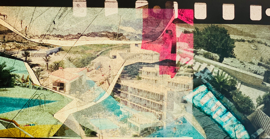
In todays workshop, Talmor was telling us about how, and why she made her series "constructed landscapes". She was telling us when she went traveling she took many pictures of the view but didn't quite know what to do with them. Talmor was telling us she used negatives to cut up and construct these new images.
When we were making our images, we used a different method. We cut up 35mm positive film slides instead of negatives. When I was making mine I used negatives that were similar to each other so it made the image look like it could be real. Because the positives were quite dark we used a Lightbox, this helped seeing the whole image and where to cut exactly.
Equipment and material used;
- slides
- scalpel
- cutting mat
- light boxes
- sellotape


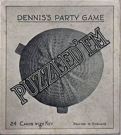
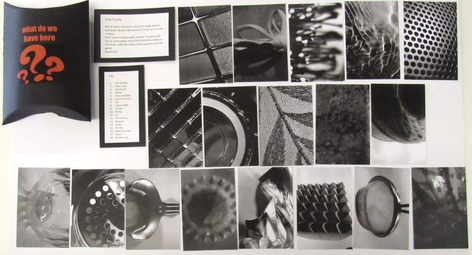
Puzzled 'em project
|
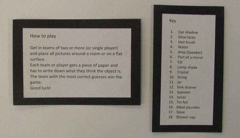
For our next project we are focusing on the 1960s party game "puzzled 'em". we are creating a series of images taken from unusual angles to confuse the viewer of what the object is. The images in the game are taken in the 60's which can confuse new generations, because some of those objects don't exist anymore. once I've taken the images I'm going to turn it black and white to confuse the viewer even more so it blocks out their sense of colour.
|
|
First puzzled 'em images


In class images


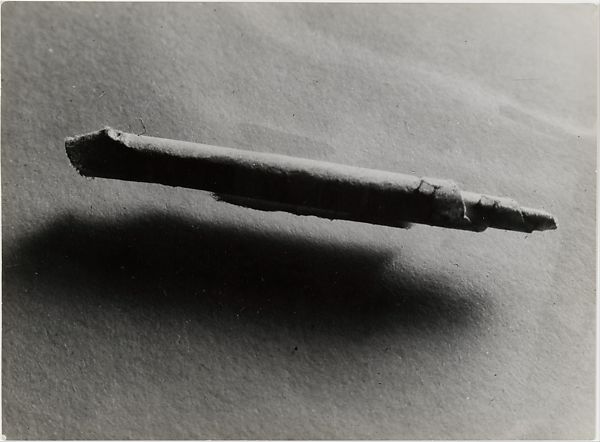
Brassai 'Involuntary Sculptures'
|
in 1932 Brassai took a series of images of objects that had been shaped, folded or angled in odd ways. The objects he chose were everyday items one use, but photographed in an unusual way to make it unrecognisable for the viewer. Brassai worked with other surrealist artists on different projects.
This image at first was confusing to me, then I realised its actually a rolled piece of paper. The paper is placed on a piece of glass to make it seem like it floating, which makes it even harder to identify. |
|
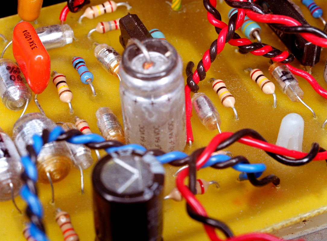
Peter Fraser 'Material'
|
Peter fraser worked around the world on different technology sites. Peter would photograph "low status material" under his bed, behind his refrigerator and so on. After months of working with this idea he started to he began to work with taking images of his equipment in the laboratories.
I really like how vibrant his images are, and how they've been taken. The angles of him images are up close and in and out of focus. |
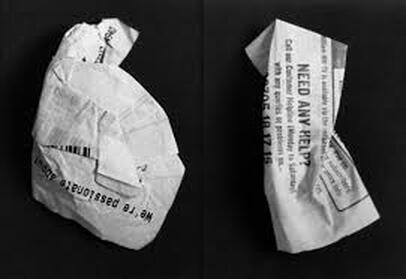
Stephen Gill 'A Series of Disappointment'
|
Stephens images have been taken from a high up angle and photographed different objects. Each object has be transformed by being twisted or folded, making it unrecognisable to the viewers. I believe he named this project 'a series of disappointments' because the objects photographed are normally things people throw away because they're not useful anymore.
I like this image because he took something not interesting and transformed it into something fascinating just by crumpling and folding them. |
|
Final images
for my final puzzled 'em game, I wanted my cards to be black and white. I thought this would make the game slightly more difficult. when editing my cards to black and white I had to change the contrast and saturation to make the images more clearer. I took my photos up close to the objects so it made it harder to identify.


Final game
|
Evaluation |
I’m really glad with my final game, and the images I chose. I used a mix of images taken up close and from a different angle. I think by doing this it makes the images more distorted in a way, and harder to recognise to the players. If I could change anything about my game, I would change the box. I think it’s quite impractical and doesn’t look as good compared to other shaped boxes.


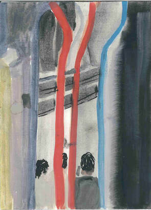
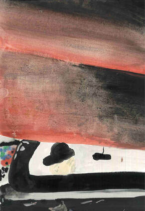
Saul Leiter
"Photography allows you to learn to look and see. You begin to see things you'd never paid attention to"
--Saul Leiter
This quote shows me how he doesn’t focus on what is normally portrayed as striking photograph, he takes images of what people don’t normally pay attention to. After looking at his images I can tell he focuses on blurred out, distorted landscapes, I've noticed its harder to tell what the image is at first so you look at it longer. he also focus a lot on colour, he makes sure they are vibrant and complementary to each other.
Saul Leiter is an American photographer whose work in the 40s and 50s was a big contribution to the New York school of photography. Leiter moved to New York at age 23 but didn't fully decide to focus on photography, he originally wanted to become a painter and go to art collage then took up photography later on. All his images are taken in the east village of Manhattan, they are taken of day to day life of New York. All his images are vibrant and contrasting colours to compliment each other. The use of line in his images change from all parts horizontal, vertical or diagonal.


|
After looking at saul leiter images, we responded by painting the images using water colour. But instead of focusing to make my painting look exactly like his images, I was trying to get all the lines in the correct place because I think thats a big features of his images. doing this helped me to proportion my images and focus on how I choose my composition. |
|


